
Microsoft has redesigned the Office icons to reflect the suite’s recent plethora of new and continuously evolving features.
This week, head of Microsoft Office design Jon Friedman unveiled the overhauled Office icons on Medium where he also outlined the thought-process behind the redesign.
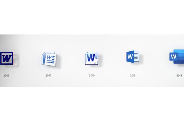
The world is a completely different place than it was five years ago when the Office icons were last updated, especially in terms of technology. The suite from 2013 is pretty unrecognisable compared to the most recent versions of the software: Office now boasts features that encourage collaboration between people across countries, supports AI-powered tools that make virtually everything easier, and even has added brand new applications including Microsoft Teams, which may not have even been a thought five years ago.
Friedman describes the new icons as a signal to users of these major product evolutions. The colours have been changed to be “bolder, lighter, and friendlier” as a nod to how Office has developed; the design has evolved to be simpler in accordance with gestalt principles – each icon looks like it belongs with the others to symbolise app interoperability.
Despite this visual overhaul, the icons are still hold true to their roots – all five generations that use the suite across various platforms and devices will still be able to identify the apps that have, in part, defined the digital revolution.


Facebook Comments